2D to 3D
Let’s start with moving from 2D to 3D. VR has one more axis than your used to in traditional 2D design apps, the Z axis.
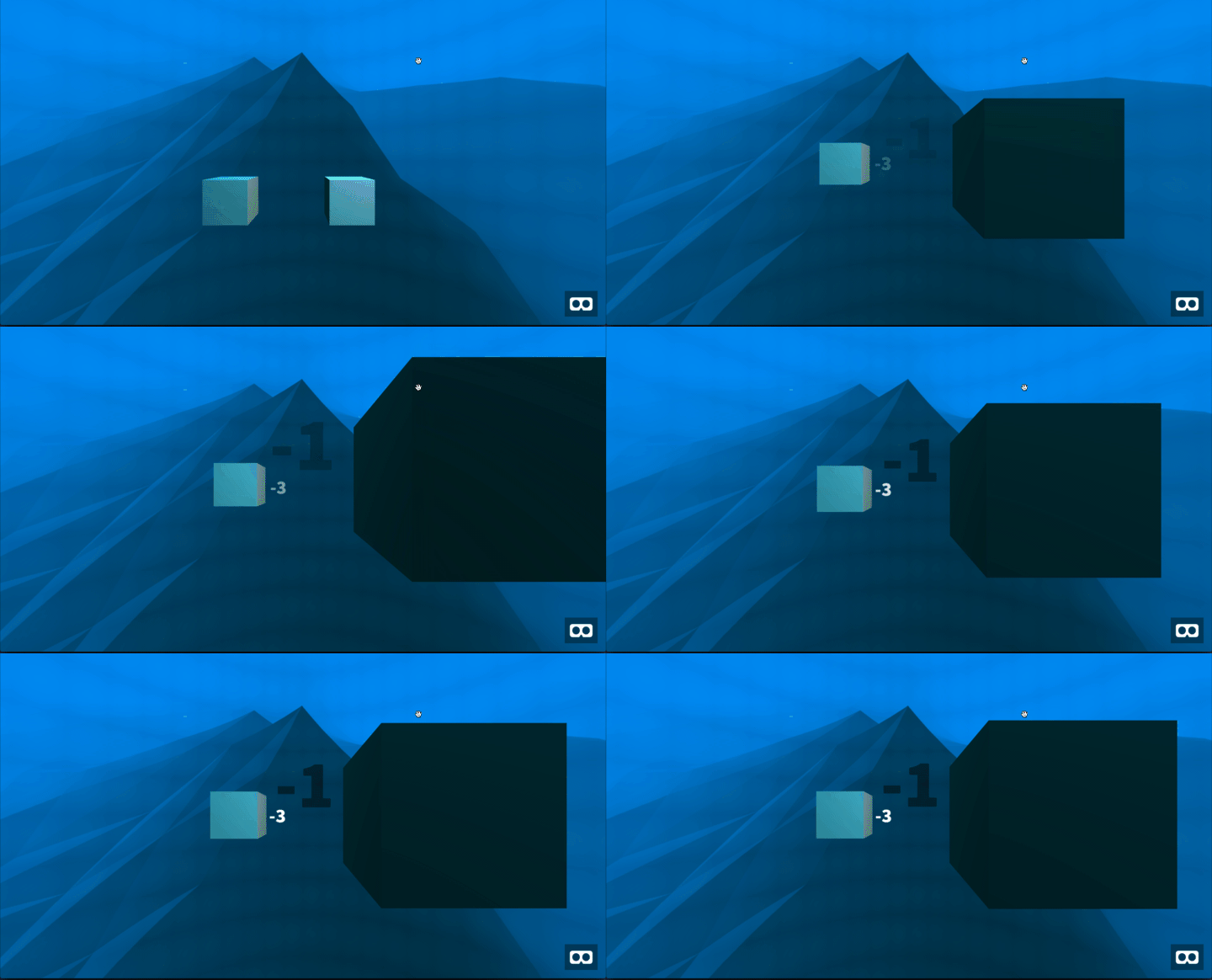
Think of it as forward and backward. A lower z value is the object moving away from you, and a higher one means moving towards you.
 A lower z value moves away, and higher one moves towards the camera.
Think From the Center
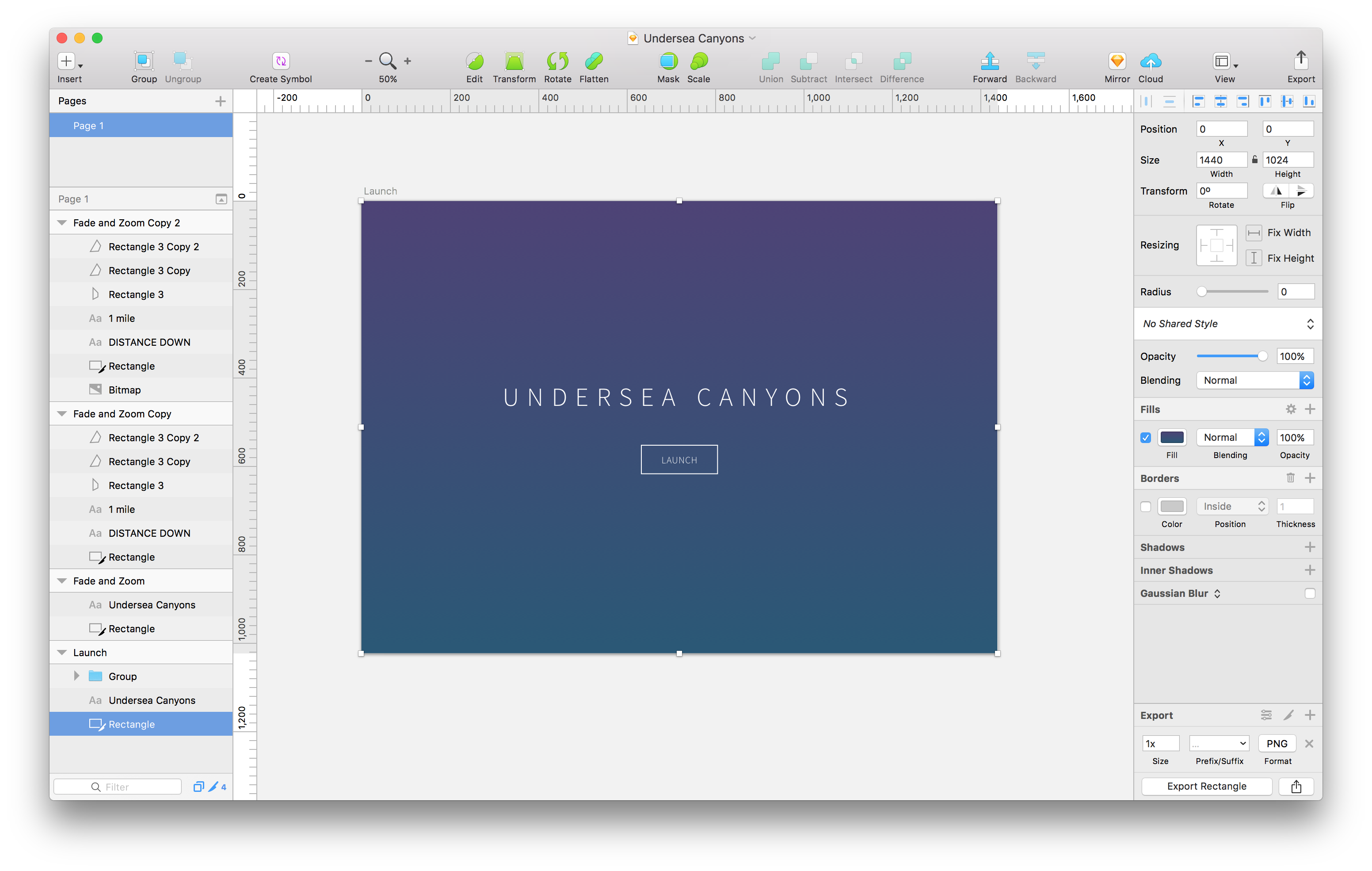
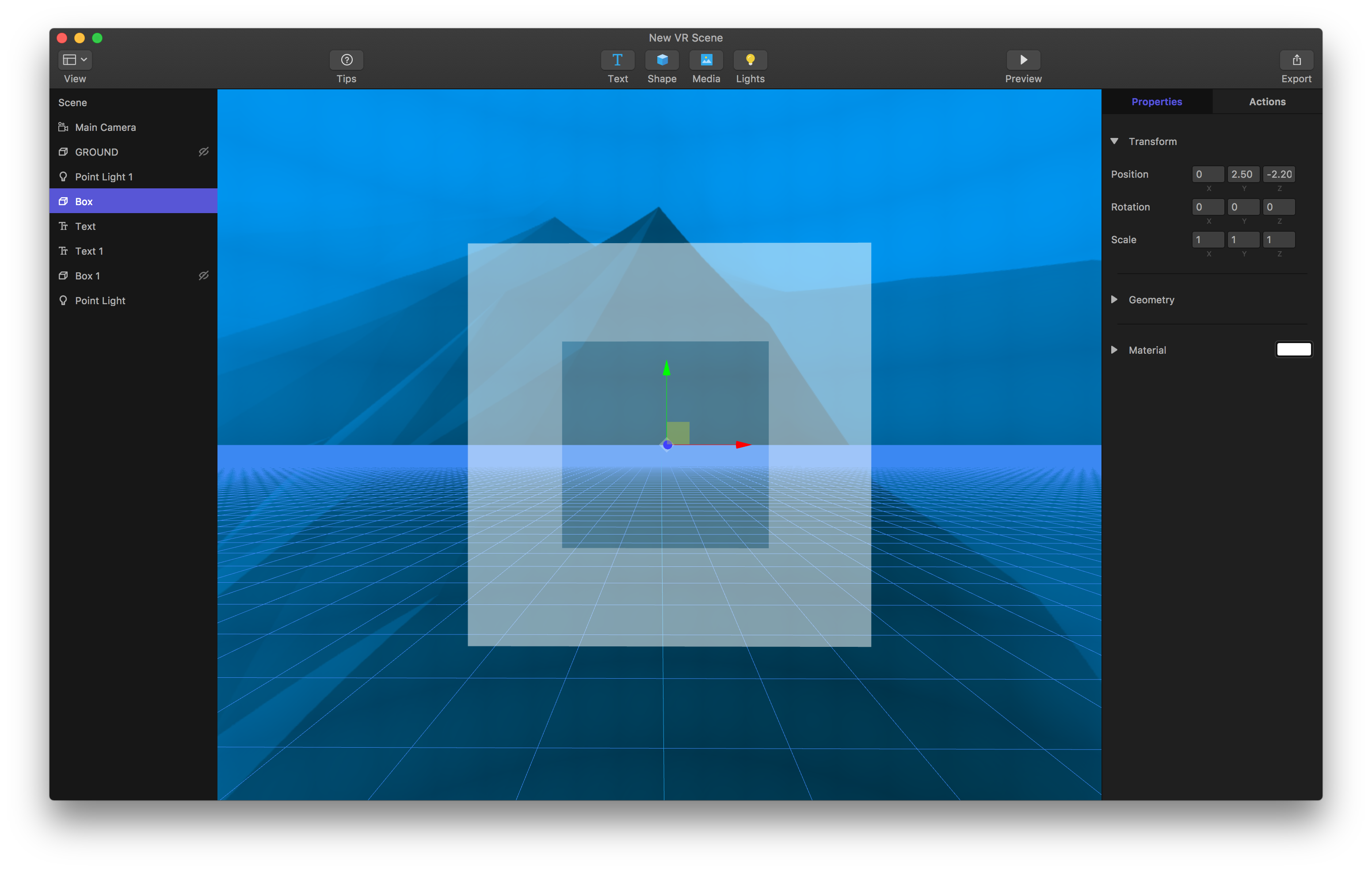
In traditional design apps, you’re X and Y values will start from the top left. In VR and A-Frame, the values start from the middle. You can refer to this as a screen coordinate system (top left origin) versus a cartesian coordinate system (middle origin).
 Apps like Sketch start X and Y from the top left.
 In WebVR Studio, A-Frame, and in most 3D design apps, X and Y start from the middle.
Pixels to Meters
The unit of measure for most design apps has been the pixel. But since you’re dealing with 3D space in VR, you’re going to use meters as the unit of measurement. This might feel foreign at first, but it makes sense as you get used to it and start designing scenes.
Here’s some perspective to think about as you set your unit values for objects in VR. A typical stop sign is 1.82 meters tall (around 6 feet). A traffic light is 4.57 meters tall (around 15 feet).
Place Objects
Now what about that Z dimension we mentioned previously, let’s rephrase that to “How close or far should you place an object in front of the camera?”
For that answer Mike Alger has pulled up some research on the subject and came up with the following numbers. For comfort on the eyes, you’ll want the object to be around 1 to 10 meters away from the camera. (1)
Closer than 1 meter and you’ll likely create eye strain for the user. Farther than 10 meters and objects will start to feel flatter. That’s not to say to not place objects in those areas, rather it’s about placing the important objects in the primary comfort area of 1 to 10 meters.
Microsoft offers a similar recommendation for object placement. They suggest that “2 meters is the recommended comfort distance for placing objects”. (2)
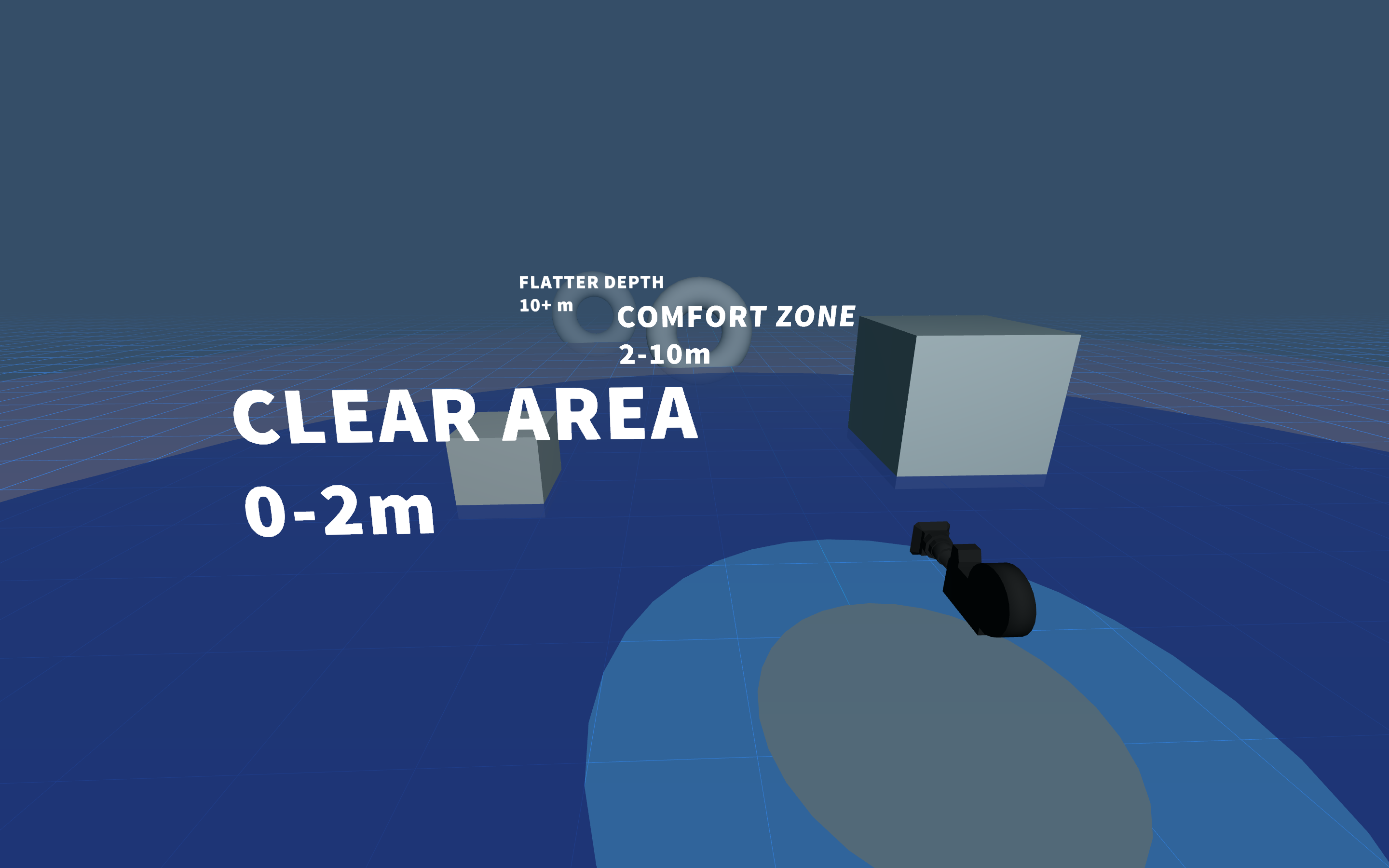
A grid guide for placing objects. 2-10 meters from the camera is the optimal space.
Download A-Frame Template.
In terms of how far to the left and how far to the right of the camera to place important objects, Alger continues to describe the area as a range of 70 degrees.
Hopefully these concepts help as you dive in to VR and WebVR. It takes a bit of getting used to coming from traditional screen design and graphic design apps, but once you do, you create whole new worlds!
(1) Mike Alger’s Research (2) Designing Typography Insight for HoloLens
