Welcome back to part two of setting moods in WebVR using A-Frame. In the first tutorial we covered how to setup and light the scene, as well as how to add fog and set the colors to match the mood.
In the second part of the series you’ll animate certain properties of the scene to make it come to life.
If you want a sneak peak of what you’ll create, check it out here.
Remix the Glitch Project
Before you begin, set up your dev environment on Glitch. You can either continue with the project you started in part 1 or remix this one.
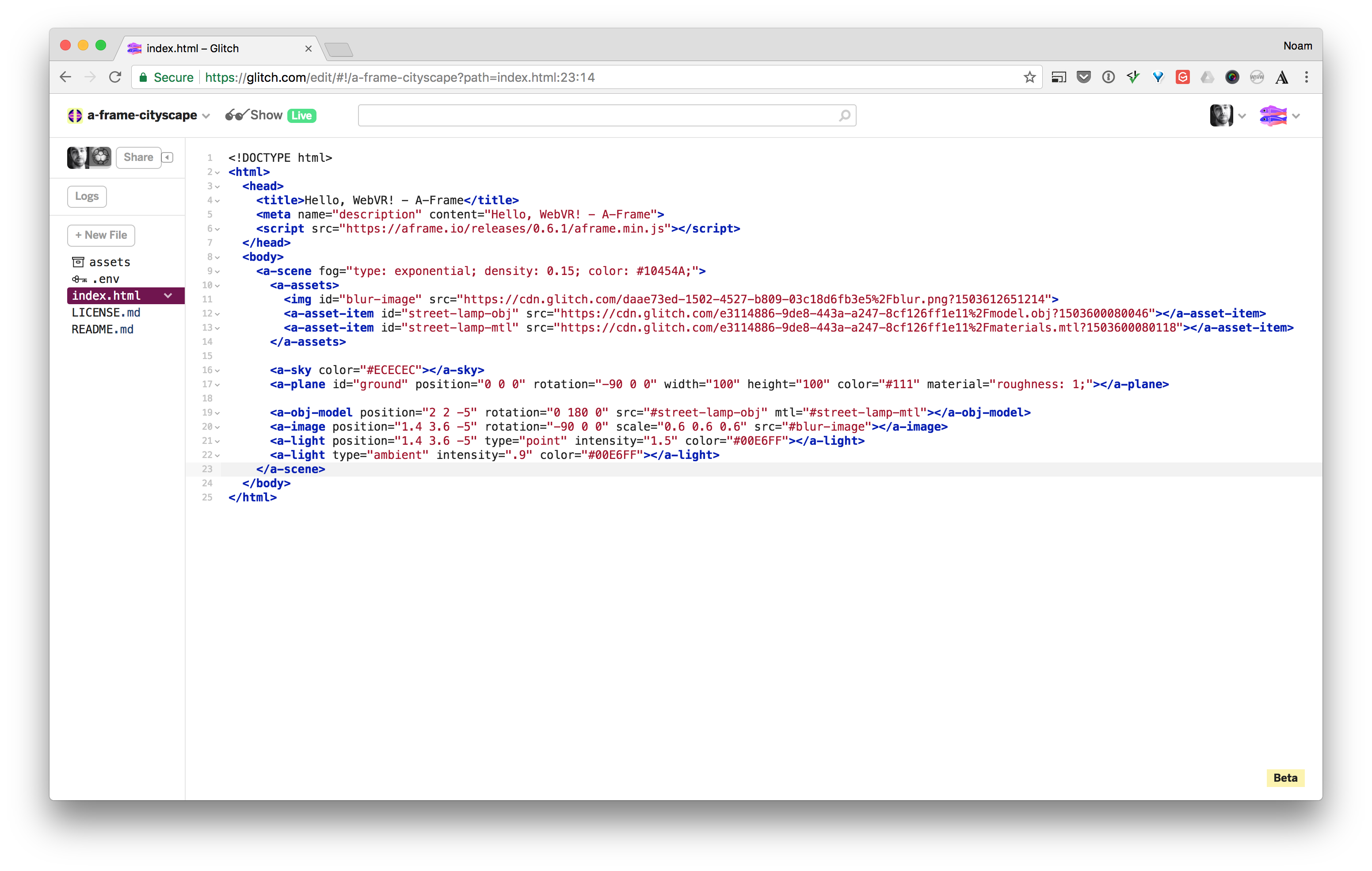
Once your Glitch project is ready, let’s dive in.
Some Animation Options in A-Frame
There are currently three ways to animate objects in A-Frame. The first is the built in animation element. The second is the community animation component. And the third is creating your own home baked solution via the Javascript API.
For the sake of simplicity we’ll stick to A-Frame’s built in animation element. In future articles we’ll investigate using the community animation component. The two systems are quite similar, they just take slightly different paths in regards to developer ergonomics and extensibility.
Why Animation
When thinking about animation—regardless of the interactive medium—it’s important to consider why you want to animate certain objects.
A few fundamental reasons to animate are;
- To direct the viewer’s attention towards a certain object or place.
- To transition between scenes or moods.
- To delight the user with an unexpected motion or movement.
Animation when used consistently can also reinforce your brand in the same way as using consistent colors. You could have a signature motion or easing that viewers associate with your creations. Think of Pixar’s lamp intro for example.
Today we’re going to experiment with all three of the animation ingredients. You’ll transition the mood of the scene from light to dark over a period of time. You’ll sequence your animations to direct the viewer’s attention. And finally, you’ll play with some easing to add a more natural feel and some delight.
The main goal of this tutorial is to introduce you to animation in WebVR with A-Frame, and to show you that it’s not as hard as it seems.
Animate the Mood with A-Frame Color Transitions
The first thing you’re going to do is animate from light to dark. There are two benefits to animating brightness changes in VR. The first is simply to let the viewer understand that something is changing over time, and to give them a chance to get comfortable with that change, as opposed to a sharp cut.
The second benefit of animating from light to dark and vise versa, is to reduce strain on the eyes. Let me use an example to explain this benefit:
Imagine you just went to the matinee showing of a movie on a sunny Sunday afternoon. The movie ends and you walk out of the theater. You’re blinded because it’s bright and sunny and your eyes aren’t yet adjusted to the day light. The same strain on the eyes can happen in VR if you cut from a dark scene to a light scene, and you could argue it creates even more strain because the eyes are so close to the screen. So to avoid this discomfort you’ll want to use animation—changing the brightness values over time gradually as opposed to sharply.
With that benefit explained, let’s animate the fog.
First change the default value of our fog to white. If you remember correctly the fog attribute lives with the scene tag.
Change the fog color from #10454A to #ffffff:
<a-scene fog="type: exponential; density: 0.15; color: #ffffff;">
Now if you preview your scene using the Show Live button at the top of your Glitch screen, you’ll notice that our mood is no longer as mysterious. Worry not, we will fix that now.
Right after the <a-assets> tag add your first animation tag like this:
<a-scene fog="type: exponential; density: 0.15; color: #ffffff;">
    <a-assets>
    ...
    </a-assets>

    <a-animation attribute="fog.color"
                 dur="7000"
                 from="#fff"
                 to="#10454A"
                 repeat="indefinite"
                 direction="alternate">
    </a-animation>
FYI: The animation element is a bit different in the way that you use it. Traditionally you would use an attribute (or component) to manipulate an element (also known as an entity). But for this use case your using a child tag instead. The community animation component mentioned above follows the more consistent pattern of using an attribute instead of a child tag.
Let’s do a quick round up of what you’re telling the animation tag to do.
First you need to tell it what attribute to animate. You’re changing the fog’s color and you use dot notation to make that connection (“fog.color”).
For single property attributes like position, rotation and scale there are no child properties so you would just do attribute=“component name” like attribute=“position”.
Next is the “dur” attribute which is the duration in milliseconds. 1000 milliseconds = 1 second. So you’re saying animate this over seven seconds.
Next is the from and to attributes. Here you’re just stating which colors to start with and to animate to.
Then you tell it to repeat forever. Followed by the direction.
The direction tells it which way to animate when it repeats. Basically it’s saying, start from the light color to the dark color, and when you go back, start from the dark color to the light color. Back and forth.
You could alternatively experiment with direction=“normal” to see it always go from “to” to “from”, which means it would cut back to the light color each time—instead of smoothly alternating back and forth. But that’s not natural in this case, because you don’t see the sun snap from light to dark.
Click the Show Live button in Glitch and you should see the scene transition from light to dark.

Save Some Energy
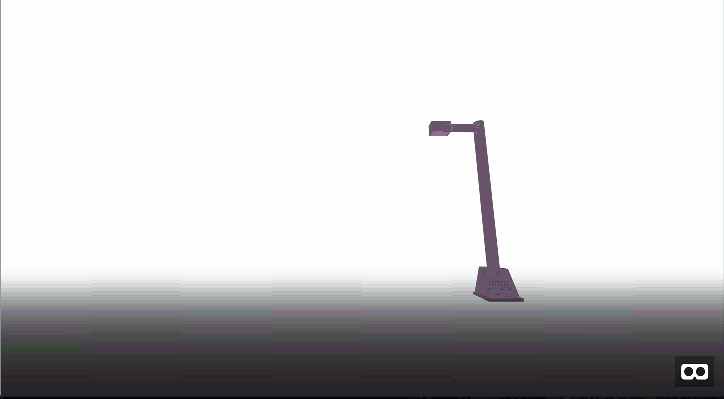
So far we have a good start on the animation, but don’t you think it’s a waste of energy to keep the lights on when it’s bright out? Let’s be more eco friendly and animate the street lamp along with the brightness transition.
This code will be nearly identical to the animation element above, just that it will animate the a-frame point light.
First change the point light’s intensity to start at 0 (turned off):
<a-light position="1.4 3.6 -5" type="point" intensity="0" color="#00E6FF"></a-light>
Now give it a child animation tag like so:
<a-light position="1.4 3.6 -5" type="point" intensity="0" color="#00E6FF">
    <a-animation attribute="light.intensity"
                 dur="7000"
                 from="0"
                 to="1.5"
                 direction="alternate"
                 repeat="indefinite">
	</a-animation>
</a-light>
Notice that the attribute for a-animation is now “light.intensity”, and we simply tell it to go from its current value of 0 to 1.5 over seven seconds, just like the fog animation. It also alternates back and forth like the fog animation.
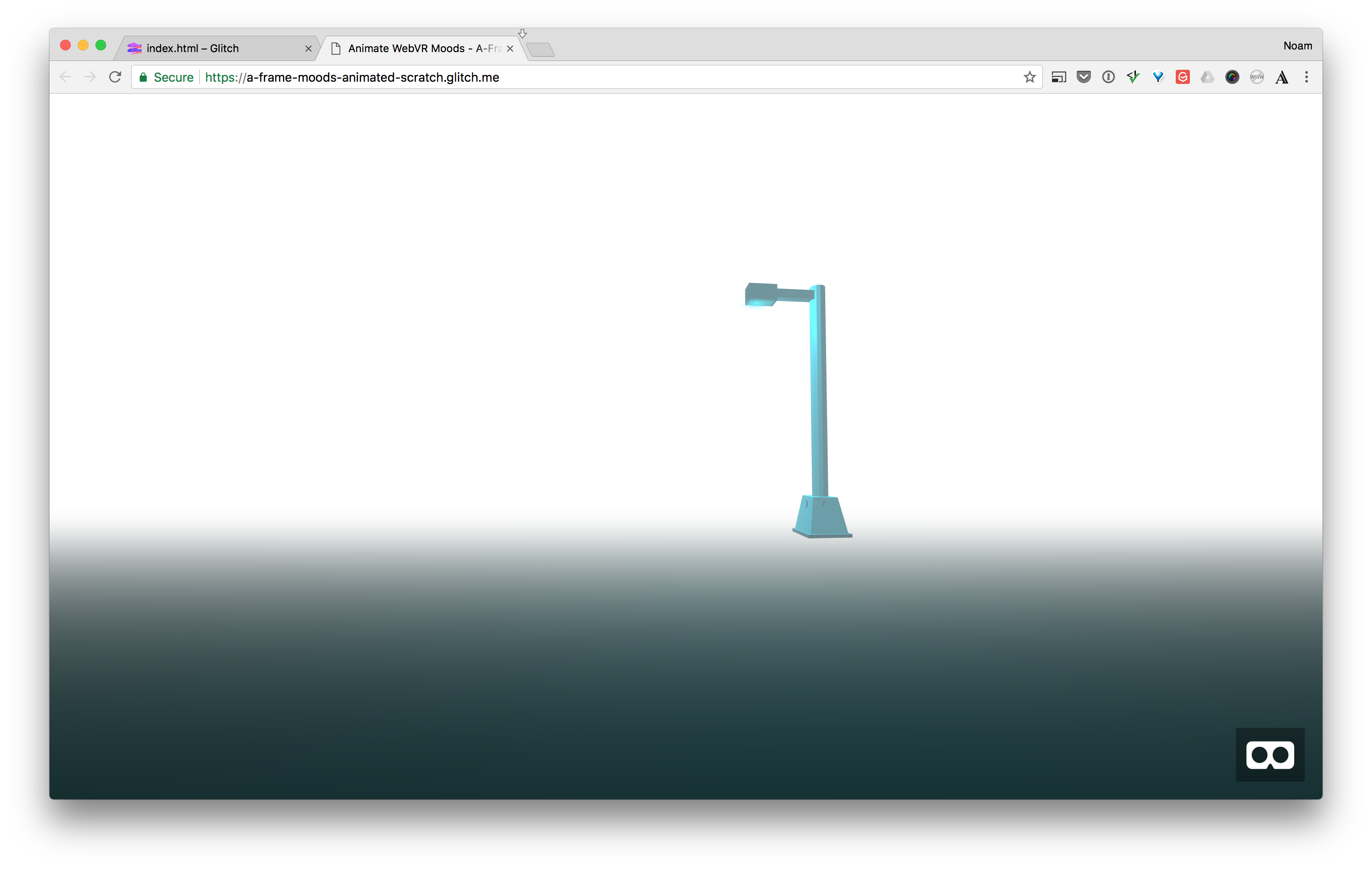
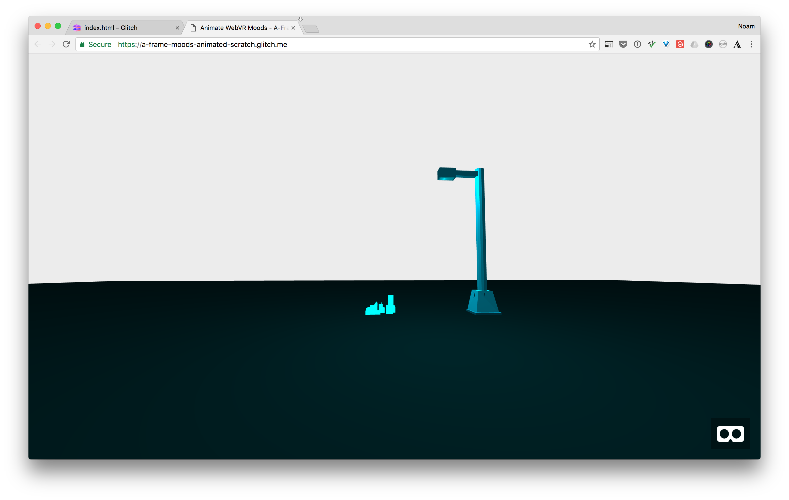
Click the Show Live button and you should see the light slowly turn on as the scene gets darker, and slowly turn off as the scene gets brighter. It’s subtle, but if you look closely, the street lamp is not illuminated when it’s brighter outside.
Let’s add one more detail, you’ll also animate the blur image, so that it looks like the street lamp’s lightbulb is also transitioning on and off.
Find the <a-image> tag above the light tag.
First set the opacity to 0, so that it begins as turned off.
<a-image position="1.4 3.6 -5" rotation="-90 0 0" scale="0.6 0.6 0.6" opacity="0" src="#blur-image"></a-image>
The opacity attribute maps to “material.opacity” under the hood.
Now give it a child animation tag, just like we’ve done so far:
<a-image position="1.4 3.6 -5" rotation="-90 0 0" scale="0.6 0.6 0.6" opacity="0"  src="#blur-image">
    <a-animation attribute="material.opacity"
                 dur="7000"
                 from="0"
                 to="1"
                 direction="alternate"
                 repeat="indefinite">
	</a-animation>
</a-image>
Now click the Show Live button and you should see all the animations in sync—Turning on as the scene gets darker, and transitioning to off as the scene gets brighter again.
The light’s are now turning on as the scene get’s darker.
Don’t Repeat Yourself
You might have noticed that all of the animation tags are nearly identical. They all share the seven second duration, as well as the same values for the “direction” and “repeat” attributes.
It’s a common goal in coding to not repeat yourself. Imagine that you want to change the duration from seven seconds to ten, now you have to do it in all three places, which is more error prone.
We’re going to solve this problem using a mixin.
Mixins
Mixins allow you to reuse common code in A-Frame. If you’re coming from the HTML and CSS background you could roughly think of it as using CSS classes. Where a number of elements share the same properties from the class.
In A-Frame this concept is a bit more powerful since you could technically also share behaviors across entities.
Let’s dive in and see it in action.
Mixins live in the <a-assets> tag. You’ll add yours at the end of the <a-assets> tag:
<a-assets>
	...
	<a-mixin id="transition" dur="7000" direction="alternate" repeat="indefinite"></a-mixin>
</a-assets>
Now let’s use it in our animations.
Go to the animation tag for the fog color. Delete the “direction”, “repeat”, and “dur” attributes from the tag, and instead replace them with the mixin attribute:
<a-animation attribute="fog.color"
             from="#fff"
             to="#10454A"
             mixin="transition">
</a-animation>
Now repeat this process for the other two animation tags in your code.
Now click the Show Live button, and your animations should work just like they did before. The benefit is that if you want to change the duration to say 3 seconds instead of 7, you only need to do it once. You also save a bit on the size of your code.
Add Easing
If you’ve never animated on the screen before, easing refers to the how an object moves through time and space.
Think of an airplane taking off. The pilot brings the throttle to full thrust and you start to speed up, but notice that it’s not a linear motion, at first it’s slow then it get’s faster and faster and faster.
Here’s how Paul Lewis describes it:
Nothing in nature moves linearly from one point to another. In reality, things tend to accelerate or decelerate as they move. Our brains are wired to expect this kind of motion, so when animating you should use this to your advantage. Natural motion makes your users feel more comfortable with your apps, which in turn leads to a better overall experience.
Quick side note: The only exception to this easing rule is when you’re animating the camera. Using easing for camera animations in VR can cause simulator sickness. I’ll cover this topic in a future post.
Ok let’s add the easing to your animations. Since you now have a mixin that can change the attributes for all three animations, you’ll add the easing attribute there:
<a-mixin id="transition" dur="7000" direction="alternate" repeat="indefinite" easing="ease-in-out"></a-mixin>
If you click the Show Live button now, the transition should feel more comfortable on the eyes and less boring than the default linear transition. For what it’s worth, my professor always said “avoid the defaults!”.
Feel free to experiment with the following values for easing: ease, ease-in, ease-out, ease-in-out. You can also use easing functions like ease-out-cubic. For the full list of easing values check out the docs here.
<a-mixin id="transition" dur="7000" direction="alternate" repeat="indefinite" easing="ease-out-cubic"></a-mixin>
With easing, your animations should feel more natural and engaging.
Reveal More Content
Everything in our scene is now in place:
- The light and fog create the mood.
- The animations create a transition from light to dark and bring the scene to life.
- They also make it easy on the eyes to go between light and dark.
- The easing attribute makes the animations feel more natural.
- And finally, the mixin helps you reduce duplicate code.
Let’s do one more thing to make the scene more engaging. When you design your WebVR scenes, it’s useful to think about how time plays a role. If your viewers see everything in front of them at once, they’ll get board quickly, so a good way to keep the story going is by revealing certain objects over time.
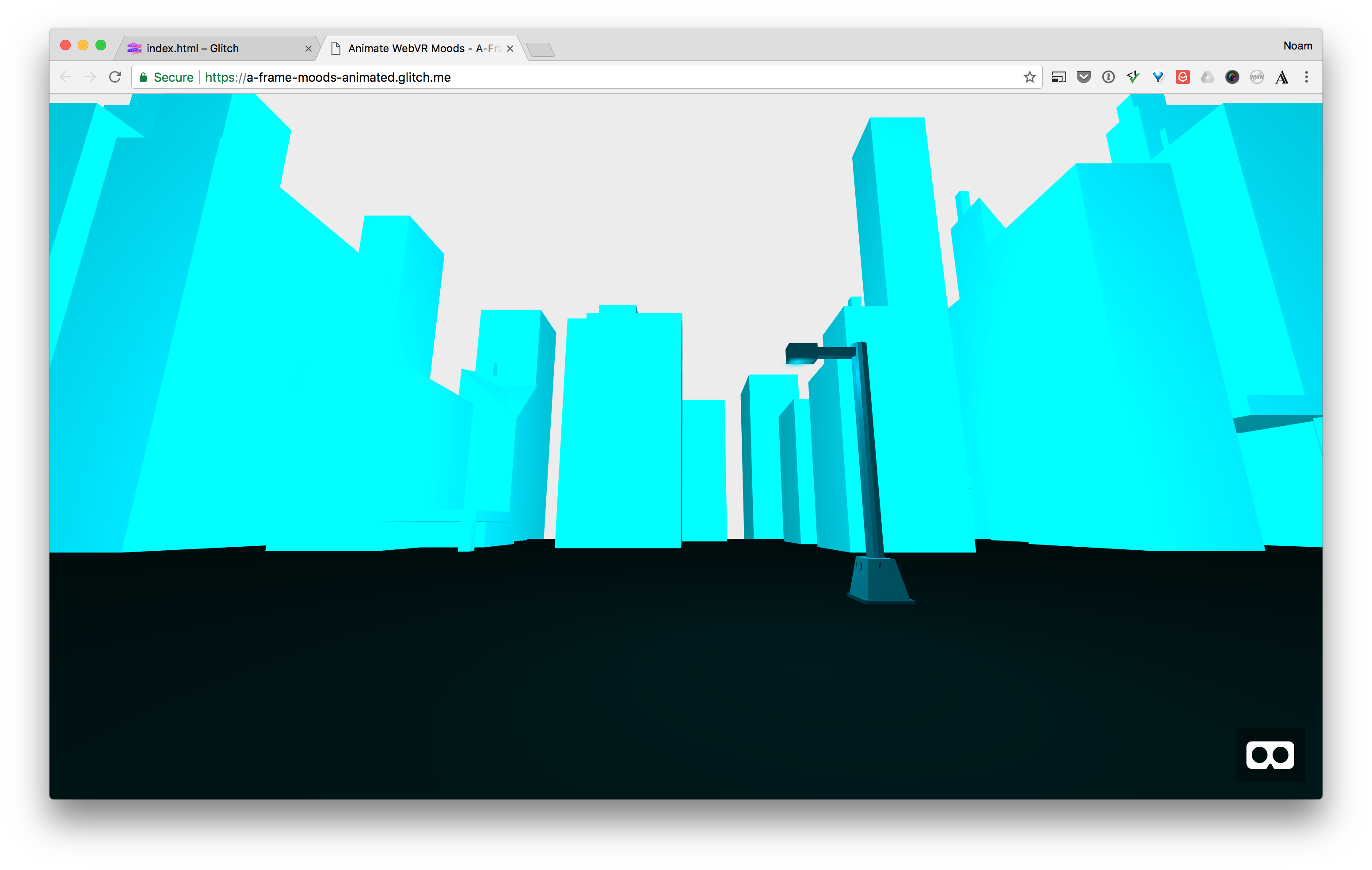
With that in mind, when it get’s dark, you’ll make the fog less dense so that it reveals a cityscape in the background—staying on the minimilist cyberpunk theme from the first tutorial.
Add the Cityscape
To add the cityscape, you’ll temporarily set the fog to 0, so that it’s turned off and comment out its animation. You’ll bring those back once your done re-composing the scene.
First set the fog density value to 0:
<a-scene fog="type: exponential; density: 0; color: #ffffff;">
Then comment out the fog animation. You create comments in your A-Frame code just like you do in HTML:
<!--
<a-animation attribute="fog.color"
	from="#fff"
	to="#10454A"
	mixin="transition">
</a-animation>
-->
Now you’ll add the model.
Just like we did in the first tutorial, you’ll add a model from Google Blocks into your scene.
Download the cityscape model created by Alex “SAFFY” Safayan here. Then unzip it on your machine.
Before you upload the model and material files to Glitch, rename them to be more meaningful. Google Blocks names all 3D models as model.obj and model.mtl. If you uploaded these files as is, it would conflict with the previous street lamp model files.
Rename the files in the unzipped folder to city-block.obj and city-block.mtl.
Now go to your assets folder in Glitch and drag the two city-block files onto the page so that they get uploaded.
Now you need to add them to your assets tag and then to your scene.
Go ahead and update the assets tag to include the two new asset items for the new model like this:
<a-asset-item id="city-obj" src="paste asset url here"></a-asset-item>
<a-asset-item id="city-mtl" src="paste asset url here"></a-asset-item>
Just like you did in part one, you’ll have to go to the assets folder, click the model and mtl file, then copy the urls. Then paste the urls into the src attributes above.

Once you have the models set in the assets tag, you’ll add them to your scene.
Add the city model right after the street lamp obj tag:
<!-- The Street Lamp Model -->
<a-obj-model position="2 2 -5" rotation="0 180 0" src="#street-lamp-obj" mtl="#street-lamp-mtl"></a-obj-model>

<!-- The City Block Model -->
<a-obj-model position="0 0 0" rotation="0 0 0" src="#city-obj" mtl="#city-mtl"></a-obj-model>
First let’s position the city model. Set the z value—the forward and backward value—to be further away from you. To do so, you’ll make it a negative number, like -10.
<a-obj-model position="0 0 -10" rotation="0 0 0" src="#city-obj" mtl="#city-mtl"></a-obj-model>
Now Click the Show live button to see what you have so far. If you’ve seen the movie Zoolander, you might be thinking: “What is this… a city for ants?!!”
Sometimes the 3D models you import are either too big or too small for your scene. You can fix that by using the scale attribute. Here’s how to fix it:
<a-obj-model position="0 0 -10" rotation="0 0 0" scale="20 20 20" src="#city-obj" mtl="#city-mtl"></a-obj-model>
Now since it’s also much bigger, let’s position it once more, I’ve arrived at these values simply by trial and error:
<a-obj-model position="0 6.7 -33" rotation="0 0 0" scale="20 20 20" src="#city-obj" mtl="#city-mtl"></a-obj-model>
Let’s do one more thing, and rotate the city block model so that it has more leading lines—inviting us into the scene. You’ll do that by rotating the model around the y axis by 90 degrees:
<a-obj-model position="0 6.7 -33" rotation="0 90 0" scale="20 20 20" src="#city-obj" mtl="#city-mtl"></a-obj-model>
Now click the Show Live button to see your progress:
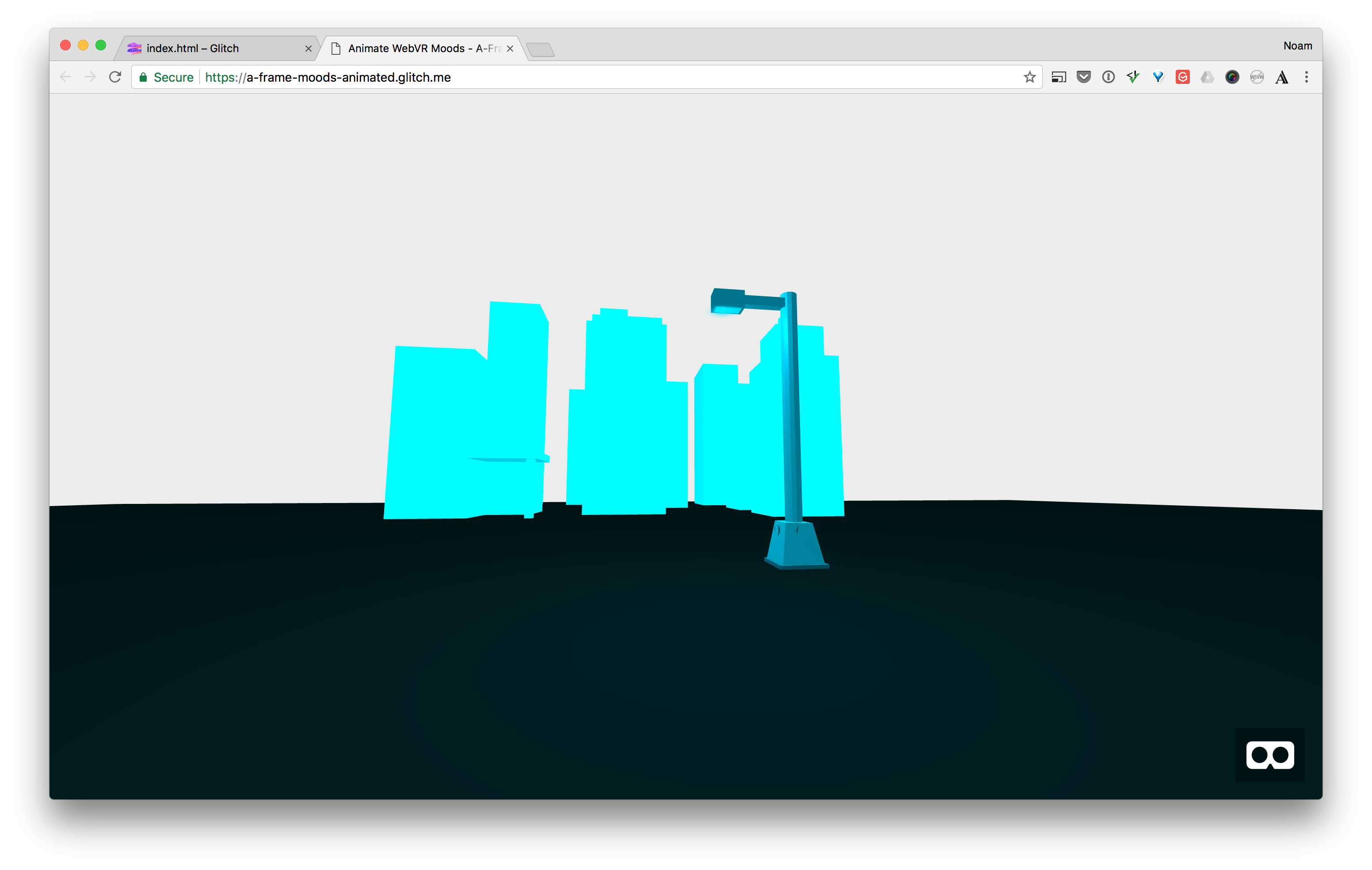
The city block model is now in the desired position, scale and rotation. But it does look kind of isolated. If you’ve ever been to New York City, you might remember how you can look down the street and see nothing but buildings in the horizon. It’s really cool to see. Let’s create that feeling by duplicating the city scape on the right and left so that it fills the screen.
Copy and paste your city scape model tag and update the code as follows:
<!-- Cityscape -->
<a-obj-model id="city-scape-left" position="-55 20 -40" rotation="0 90 0" scale="30 65 35" src="#city-obj" mtl="#city-mtl"></a-obj-model>
<a-obj-model id="city-scape" position="-5 8 -40" rotation="0 90 0" scale="30 35 35" src="#city-obj" mtl="#city-mtl"></a-obj-model>
<a-obj-model id="city-scape-right" position="50 20 -40" rotation="0 90 0" scale="30 65 35" src="#city-obj" mtl="#city-mtl"></a-obj-model>
Notice I’ve added ids to each tag so that you know which they refer to in the scene. I’ve also played a bit with the scales and positions to make them look bigger.
Now we need to bring back to fog to make it more mysterious and engaging, aka set the mood.
Before we do so, let’s do one more thing, and change the ambient light color to have more contrast with the neon green. I’ve chosen a slightly more pink color, that will hopefully keep the cyberpunk aesthetic.
Change the color of the ambient light at the bottom of the code to #FF54CA.
<a-light type="ambient" intensity=".5" color="#FF54CA"></a-light>
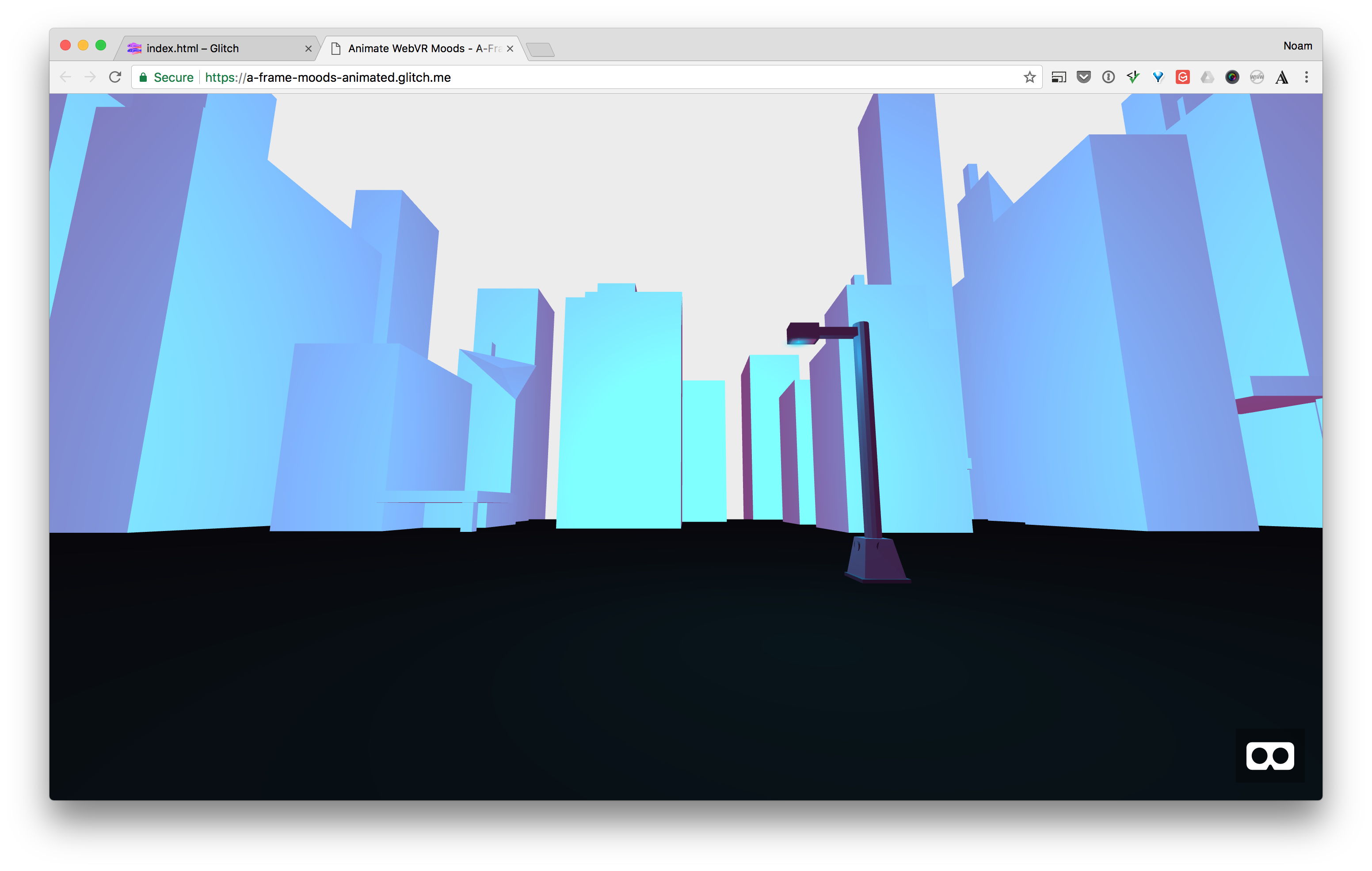
Now the lighting is a bit more gradient like than flat.
Bringing It All Back Together
It’s time to bring all of your work back together to reveal the cityscape!
First set the fog density back to 0.15.
Uncomment the fog animation for light and dark.
Now you’ll add one more fog animation for its density. What’s going to happen is that the fog will get less dense as the scene gets darker, and as a result your city scape will be revealed to the viewer.
<a-animation attribute="fog.color"
             from="#fff"
             to="#10454A"
             mixin="transition">
</a-animation>
<a-animation attribute="fog.density"
             from="0.15"
             to="0.03"
             mixin="transition">
</a-animation>
Once you have that code set, time to click the Show live button one more time and see your animated WebVR scene built with A-Frame!
What’s Next
Hopefully your getting the hang of A-Frame and this makes you want to experiment more. If you want to take a look at the code, I’ve cleaned it up a bit and you can see it here. In the next part of the series you’ll add interaction with events and animation. See you next time!