Today we’ll create a VR UI that’s inspired by KickPush’s article on Smashing Mag.
Luckily for us, we don’t need to create a native mobile app because we’ll be using WebVR and A-Frame to make our VR scene in the browser!
For reference, lets take a look at KickPush’s example.
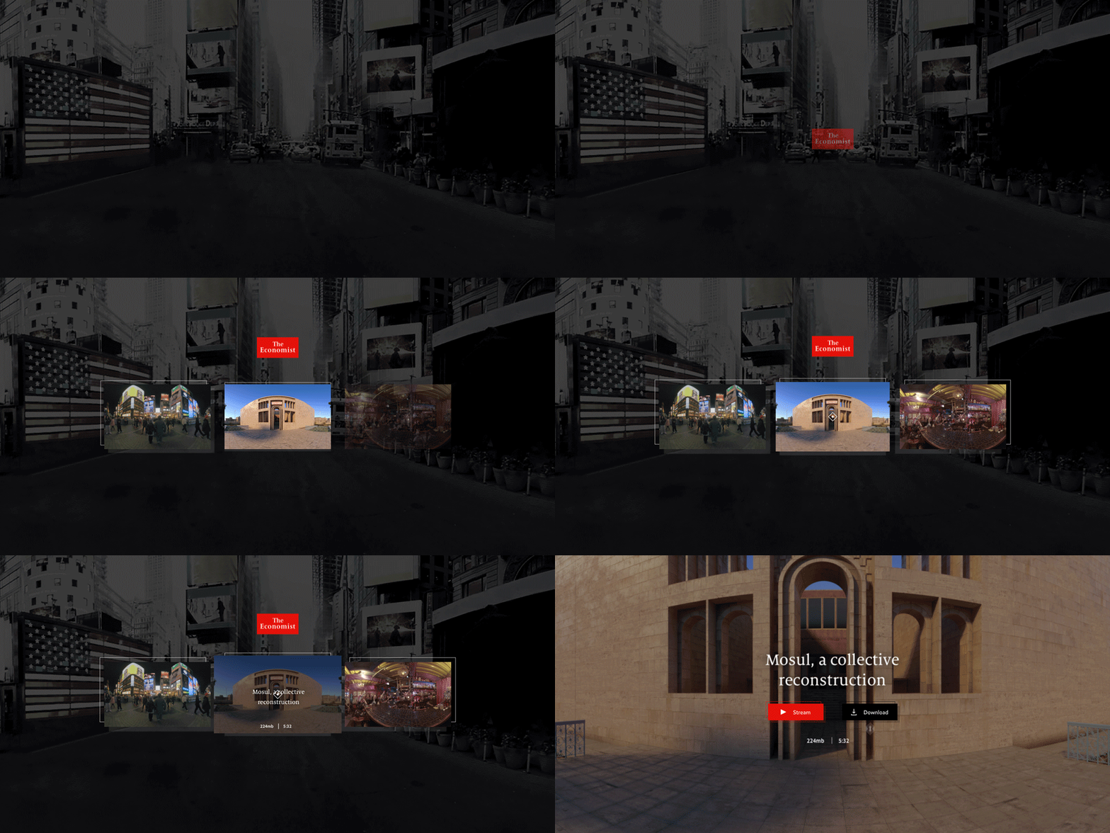
Notice that the tiles fade up as the scene begins. When you hover over the middle tile, it transitions up and shows a headline. Finally, when you click on the tile, it animates towards you and then transitions at the last second, to the next scene.
There are few more details to note, such as the logo animation and background decorations behind the tiles. I’ll skip over those today to stay focused on the big picture of creating a WebVR UI.
Here’s a glimpse of the UI that you’ll create in A-Frame and you can visit the live example here. Note that instead of hover events, I’ve opted for click events, so click the middle tile to start interacting with the scene.
Before You Begin
As usual, you’ll want to set up a dev environment to walk through the tutorial, the easiest way is to remix this Glitch project. Go ahead and remix it by clicking the “Remix this” button, and then let’s dive in!
Note that I’ve already added images to this project so that we don’t need to cover how to add images and assets in Glitch and A-Frame again. If you’re new to uploading and using images, check out this earlier tutorial that covers that workflow more in depth.
Build the Scene
First let’s set up the background. In KickPush’s example, we have an image of Times Square NYC. The designers thoughtfully chose an image with leading lines to draw the viewer in. This is a very useful technique from the world of photography—where leading lines directed at the horizon, add depth to your images. It translates naturally into VR as well.
First let’s create a large sphere that will house the image.
After the sky tag go ahead and add the following tag for the sphere:
<a-sphere radius="100" position="0 0 0" src="#start-bg"></a-sphere>
Note that you could arguably use the sky tag itself for the background image, but because we want a bit more control later on, I’ve chosen to add this sphere element.
If you click the “Show live” button now, you won’t see anything yet. That’s because we’re actually inside the sphere. To make it so that we can see the image, we need to set the material to be double sided. By default it’s front sided—where you can only see the outside.
Let’s add the material attribute to fix this:
<a-sphere id="main-bg" radius="100" position="0 0 0" src="#start-bg" material="side: double;"></a-sphere>
Now if you click the “Show live” button you’ll see our background.
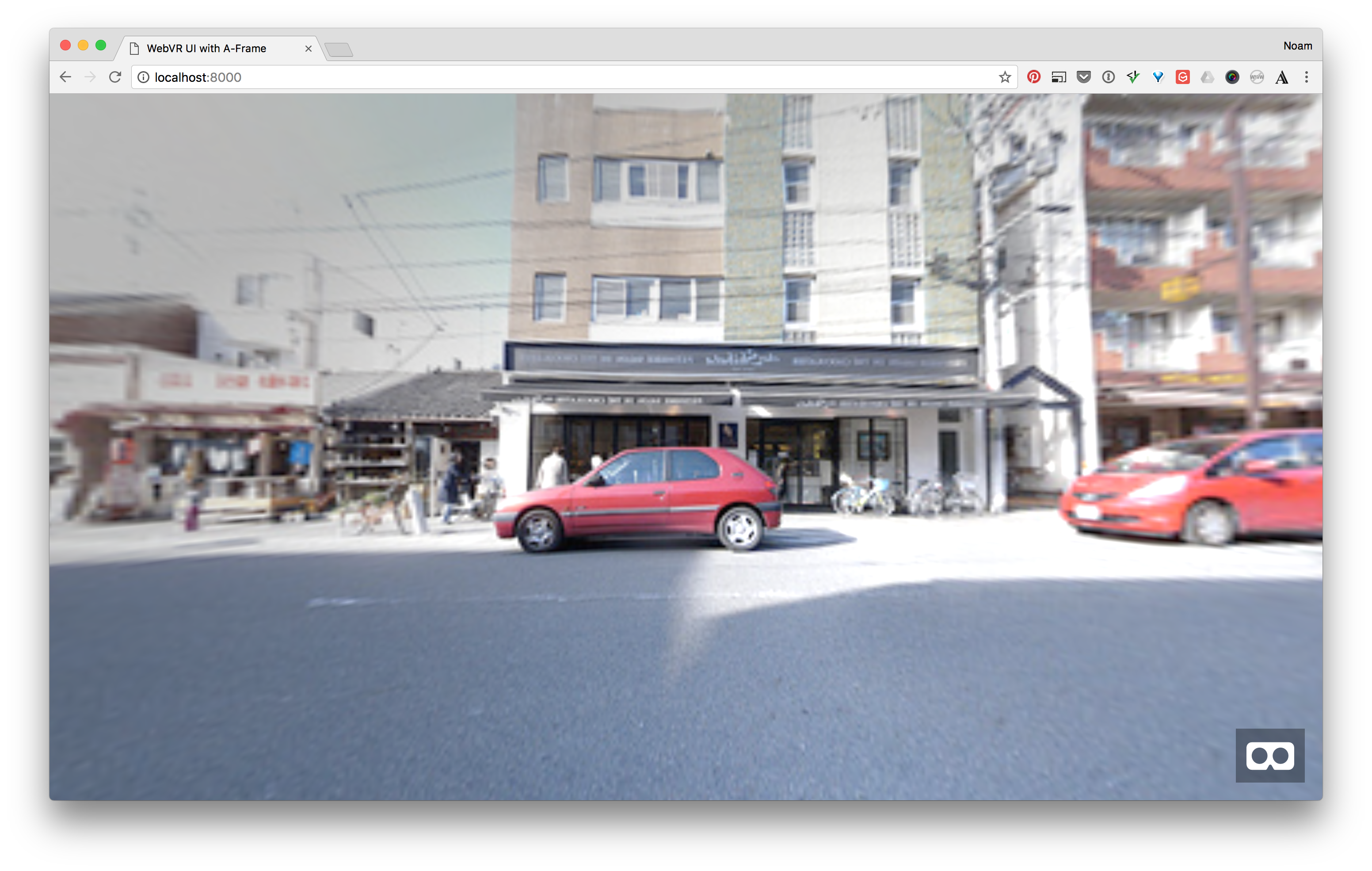
Let’s add a bit more detail. In our reference example, the starting background is tinted black. We’ll add a color attribute to our sphere that will create a similar effect. Alternatively you could also use a black and white image. We’ll also rotate the sphere 90 degrees so that we use the image’s leading lines to draw the viewer in.
Update your sphere with the color attribute like this, and you should see it appear a bit darker. Then also add the rotation attribute as well:
<a-sphere id="main-bg" radius="100" position="0 0 0" rotation="0 90 0" src="#start-bg" color="#333333" material="side: double;"></a-sphere>
Now if you click the Show live button, our initial composition is how we want it: looking into the street’s leading lines and tinted darker so that the UI that we’ll add next, stands out.
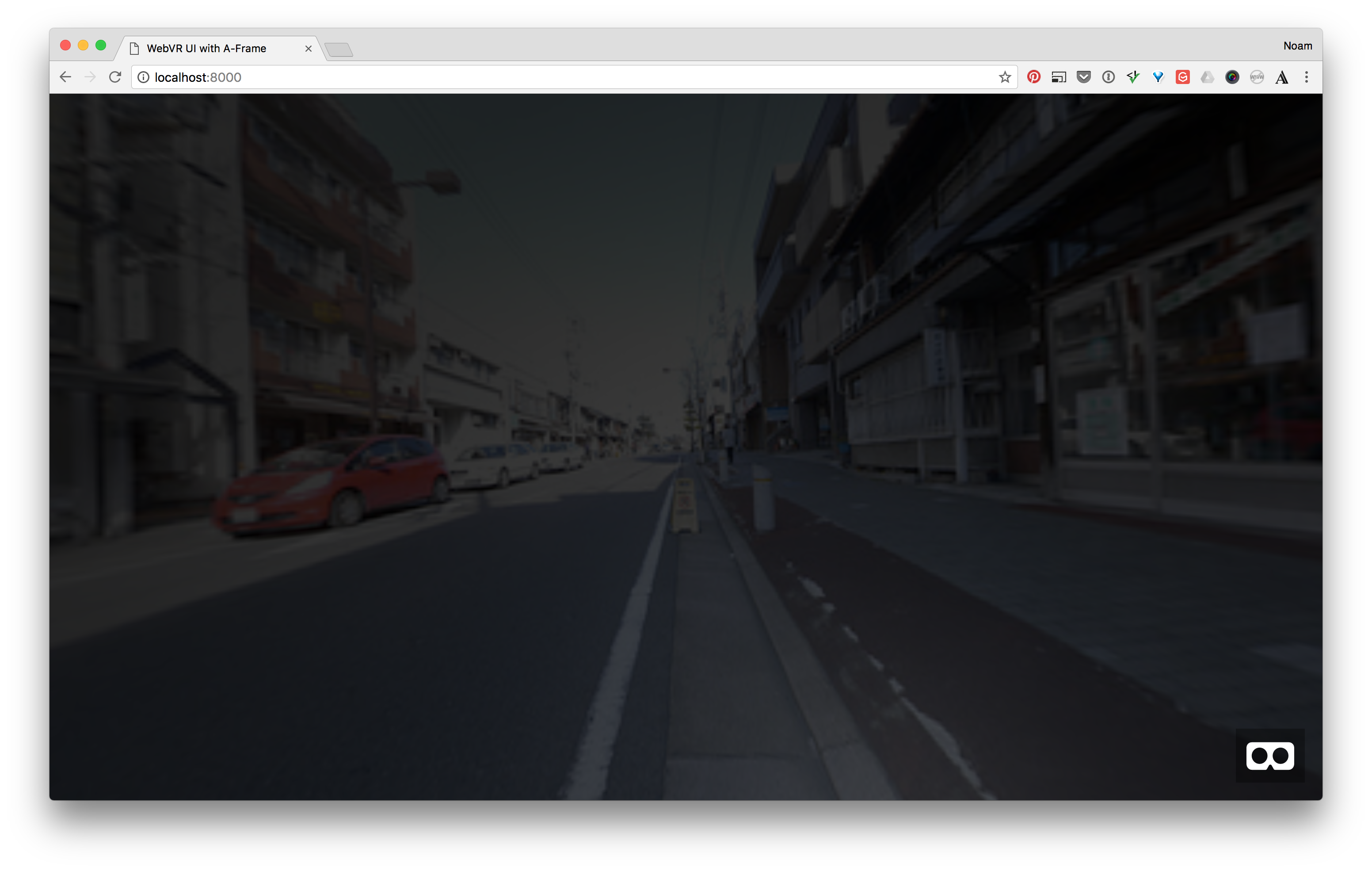
Add and Animate the UI Tiles
Now let’s add the image tiles, and then we’ll fade them in when the scene starts.
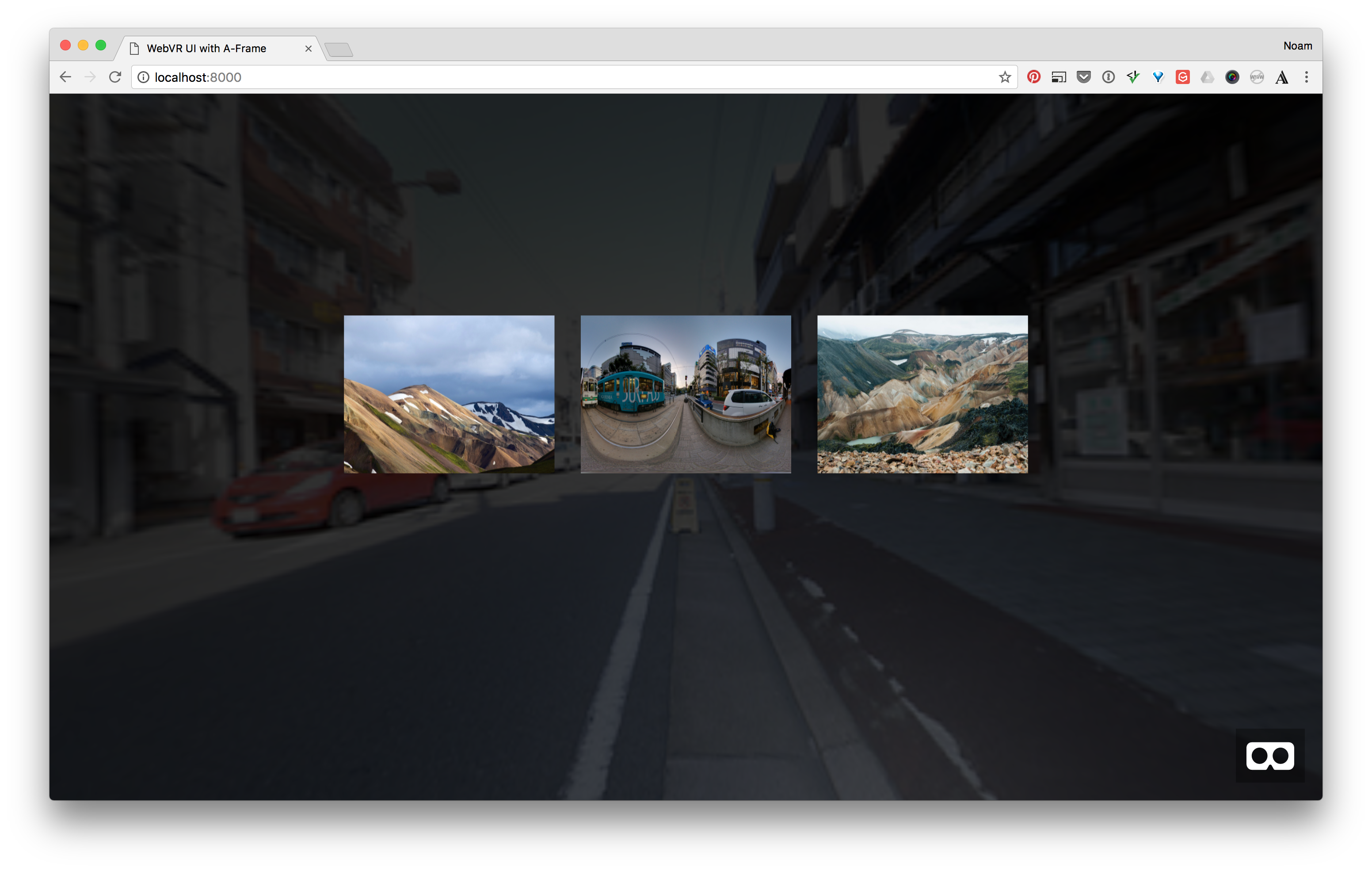
Begin with the image tags below. Notice that I’ve positioned each one so that they line up with a half meter gutter between them. The images are 4x3 and are 8 meters away from us.
<a-image id="left-tile" class="tile" position="-4.5 1 -8" src="#left-tile-image" width="4" height="3"></a-image>
<a-image id="center-tile" class="tile" position="0 1 -8" src="#detail-bg" width="4" height="3"></a-image>
<a-image id="right-tile" class="tile" position="4.5 1 -8" src="#right-tile-image" width="4" height="3"></a-image>
If you click the Show live button now, you should see the first part of our VR UI.
Animate the Tiles
The next step is the animate the tiles as the scene begins. In earlier tutorials we’ve used the built in animation tag, but today we’ll use the community animation component created by Kevin. It’s built on top of anime.js under the hood, and the API works just like the other attributes/components in A-Frame.
First we need to load the component after we load A-Frame itself—in the head of the document. Paste this line after the A-Frame script tag, so that we load the animation component from the CDN:
<script src="https://unpkg.com/aframe-animation-component/dist/aframe-animation-component.min.js"></script>
Now let’s go back to our image tags and set the starting animations. The way it will work is that that left image will start to fade in, and the other two image tiles will have a delay so that we create a sequence. This will allow the eye to follow from left to right. It’s a bit more elegant than fading them all in at the same time, since it leads the eyes.
Here’s the code for the transitions. Notice that we’re setting the animation attribute on each image tag and that the last two have delays for the sequencing:
<a-image
  id="left-tile"
  class="tile"
  position="-4.5 1 -8"
  src="#left-tile-image"
  width="4" height="3"
  animation="property: opacity; dir: normal; dur: 500;
               easing: easeOutQuad; loop: false; from:0; to: 1;"></a-image>

<a-image
  id="center-tile"
  class="tile"
  position="0 1 -8"
  src="#detail-bg"
  width="4" height="3"
  animation="property: opacity; dir: normal; dur: 500;
               easing: easeOutQuad; loop: false; from:0; to: 1; delay: 250;"></a-image>

<a-image
  id="right-tile"
  class="tile"
  position="4.5 1 -8"
  src="#right-tile-image"
  width="4" height="3"
  animation="property: opacity; dir: normal; dur: 500;
               easing: easeOutQuad; loop: false; from:0; to: 1; delay: 500"></a-image>
If you press the Show live button now, you’ll get a mixed result—depending on your internet connection and hardware. The animation might have already started when the scene appears and the transition looks a bit rough, if not too fast.
Let’s alleviate that by changing the delay and duration values. We’ll set the left tile to wait for 1 second before starting, and also set the animations to be 1.5 seconds instead of .5 seconds. Then we’ll change the other remaining tiles to be in sequence.
Here’s the updated code:
<a-image
  id="left-tile"
  class="tile"
  position="-4.5 1 -8"
  src="#left-tile-image"
  width="4"
  height="3"
  opacity="0"
  animation="property: opacity; dir: normal; dur: 1500;
             easing: easeOutQuad; loop: false; from:0; to: 1; delay: 1000">
</a-image>

<a-image
  id="center-tile"
  class="tile"
  position="0 1 -8"
  src="#detail-bg"
  width="4"
  height="3"
  opacity="0"
  animation="property: opacity; dir: normal; dur: 1500;
             easing: easeOutQuad; loop: false; from:0; to: 1; delay: 1250;"></a-image>

<a-image
  id="right-tile"
  class="tile"
  position="4.5 1 -8"
  src="#right-tile-image"
  width="4"
  height="3"
  opacity="0"
  animation="property: opacity; dir: normal; dur: 1500;
             easing: easeOutQuad; loop: false; from:0; to: 1; delay: 1500;"></a-image>
Now click the Show live button, it should look much better.

Add the Hover Content
With our tiles in place and fading in, we can move on to the next part, adding the hover content for the middle tile and then animating it.
Before we add the hover content let’s wrap the tile with a container, so that all of the tags related to that tile are under one element. You could roughly think of it as adding a wrapper div in HTML.
Find the middle image, and we’ll refactor it in the following manner:
First we’ll wrap it with a transparent plane element. Then we’ll update the position code, we’ll make the container hold the global position, and make the image position be relative to that. We’ll also update the IDs to be more semantic:
<a-plane id="center-tile" position="0 1 -8" width="4" height="3" opacity="0">
  <a-image
    id="center-tile-image"
    class="tile"
    position="0 0 0"
    src="#detail-bg"
    width="4"
    height="3"
    opacity="0"
    animation="property: opacity; dir: normal; dur: 1500;
               easing: easeOutQuad; loop: false; from:0; to: 1; delay: 1250;">
  </a-image>
</a-plane>
Add the Overlay
Now let’s add the hover content. After the image tag in our tile container, add the overlay plane like this:
<a-plane id="center-tile" position="0 1 -8" width="4" height="3" opacity="0">
  <a-image
    id="center-tile-image"
    class="tile"
    position="0 0 0"
    src="#detail-bg"
    width="4"
    height="3"
    opacity="0"
    animation="property: opacity; dir: normal; dur: 1500;
               easing: easeOutQuad; loop: false; from:0; to: 1; delay: 1250;"></a-image>
  <a-plane id="center-tile-overlay" width="4" height="3" position="0 0 0.01" color="#000" opacity="0.75"></a-plane>
</a-plane>
If you click the Show live button now, you’ll see the tile appear on top of the image. We’ll update the animation and opacity values right after we add the text element, next.
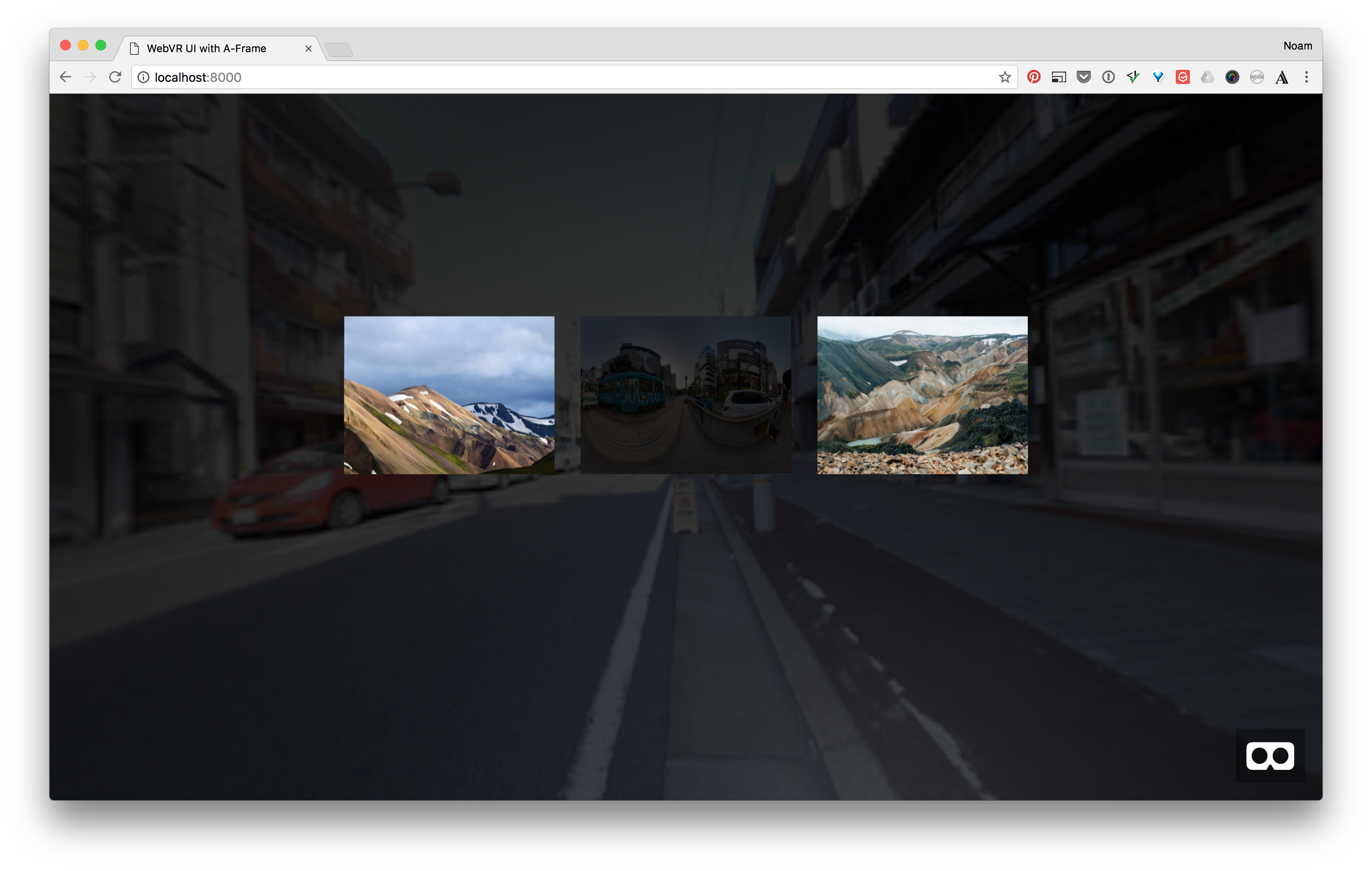
To add the text for the tile, we’ll use A-Frame’s text tag. Here’s the markup that you’ll add after the overlay plane:
<a-text id="center-tile-text" position="0 .25 .02" align="center" line-height="64" opacity="1" value="Kumamoto City\nJapan"></a-text>
Notice that text in A-Frame is slightly different than in HTML, the text content lives in an attribute as opposed to inside the tag. You add line breaks using “\n” in the value attribute.
Also notice that I’ve purposely placed the text slightly higher on the tile, so that we have room for a button that we’ll add next.
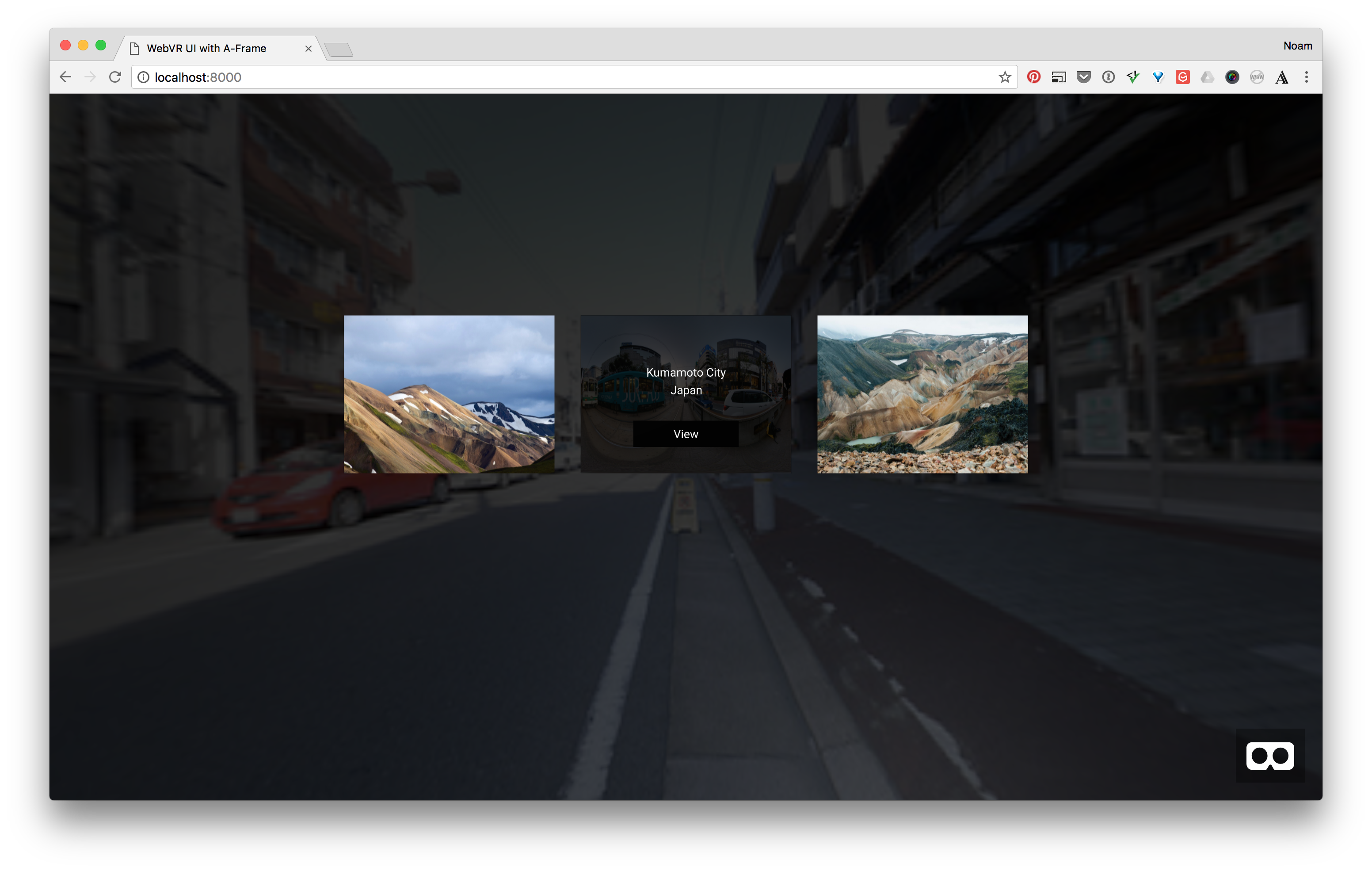
If you click the show live button now, you should see the text appear.

Let’s add two more items that will form a “View” button—so that the user can click it and “transition into” the next scene.
After the text tag, go ahead and add the following markup to create a “View” button:
<a-plane id="center-tile-cta" width="2" height=".5" position="0 -.75 .01" color="#000" opacity="1">
  <a-text id="center-tile-cta-text" position="0 0 .02" align="center" line-height="64" opacity="1" value="View"></a-text>
</a-plane>
Now when you click Show live, we should have all the elements in place for the next step, adding the interactions.
Create the Hover Transition
First let’s set the opacity values on the overlay, text and view button to 0:
<a-plane id="center-tile-overlay" width="4" height="3" position="0 0 0.01" color="#000" opacity="0"></a-plane>
  <a-text id="center-tile-text" position="0 .25 .02" align="center" line-height="64" opacity="0" value="Kumamoto City\nJapan"></a-text>

  <a-plane id="center-tile-cta" width="2" height=".5" position="0 -.75 .01" color="#000" opacity="0">
  <a-text id="center-tile-cta-text" position="0 0 .02" align="center" line-height="64" opacity="0" value="View"></a-text>
</a-plane>
That should bring us back to the tiles fading in when the scene starts.
Now let’s add the animations for “fading in” the overlay contents. Take note that each animation has a “startEvents” property to tell it when to fade in. In our case that will be a click on the tile. Here is the first pass at the markup:
<a-plane id="center-tile-overlay" width="4" height="3" position="0 0 0.01" color="#000" opacity="0"
         animation="property: opacity; dir: normal; dur: 500;
                    easing: easeOutQuad; loop: false; from:0; to: 1; startEvents: clickDown;"></a-plane>

 <a-text id="center-tile-text" position="0 .25 .02" align="center" line-height="64" opacity="0" value="Kumamoto City\nJapan"
         animation="property: opacity; dir: normal; dur: 500; easing: easeOutQuad; loop: false; from:0; to: 1; startEvents: clickDown;">
 </a-text>

<a-plane id="center-tile-cta" width="2" height=".5" position="0 -.75 .01" color="#000" opacity="0"
         animation="property: opacity; dir: normal; dur: 500; easing: easeOutQuad; loop: false; from:0; to: 1; startEvents: clickDown;">
  <a-text id="center-tile-cta-text" position="0 0 .02" align="center" line-height="64" opacity="0" value="View"
          animation="property: opacity; dir: normal; dur: 500; easing: easeOutQuad; loop: false; from:0; to: 1; startEvents: clickDown;"></a-text>
</a-plane>
If you look at that last markup closely, you’ll notice we have lots of duplicate code! Let’s fix that by using a mixin. We’ll add a mixin at the end of our assets tag like this:
  ...assets
  <a-mixin id="overlay-fade-in" animation="property: opacity; dir: normal; dur: 500; easing: easeOutQuad; loop: false; from:0; to: .75; startEvents: clickDown;"></a-mixin>
</a-assets>
Now we’ll replace those animation attributes with our mixin and it should look much cleaner!
<a-plane id="center-tile-overlay" width="4" height="3" position="0 0 0.01" color="#000" opacity="0"
         mixin="overlay-fade-in"></a-plane>
<a-text id="center-tile-text" position="0 .25 .02" align="center" line-height="64" opacity="0" value="Kumamoto City\nJapan"
        mixin="overlay-fade-in"></a-text>

<a-plane id="center-tile-cta" width="2" height=".5" position="0 -.75 .01" color="#000" opacity="0"
         mixin="overlay-fade-in">
  <a-text id="center-tile-cta-text" position="0 0 .02" align="center" line-height="64" opacity="0" value="View"
          mixin="overlay-fade-in"></a-text>
</a-plane>
With our mixin in place, let’s make it click!
Click Events in A-Frame
A-Frame uses what’s called a Raycaster component to enable clicks in your VR scene. You can think of the Raycaster as a laser beam that shoots out into the distance (the z axis in this case). The beam then intersects with the objects in the scene.
The docs explain it quite nicely:
Raycasting is the method of extending a line from an origin towards a direction, and checking whether that line intersects with other entities.
On top of the raycaster sits the cursor component. It will enable us to incorporate mouse events on desktop browsers, and can also incorporate gaze based interaction in hardware like Google Cardboard.
To enable both the raycaster and cursor components we’ll add them as children of the camera. In other words we’ll become the super hero Cyclops!
By default, A-Frame adds a camera to the scene, but we need to overwrite that so that we can add our cursors.
Right after the beginning scene tag, add the following markup:
<a-scene>
  <a-entity id="main-camera" camera look-controls>
    <a-entity cursor="rayOrigin: mouse;" raycaster="objects: .clickable"></a-entity>
  </a-entity>
We’re telling A-Frame to set this camera, and add the raycaster and cursor so that we can have interactions.
We’re also telling the cursor to use the mouse as the input, and then for the raycaster to only look for objects with the class called “clickable”—so that it doesn’t test against every element in the scene, and it’s good practice for performance.
Activate the Overlay
Here’s what we want to do for the interaction:
- The user will click the center tile container.
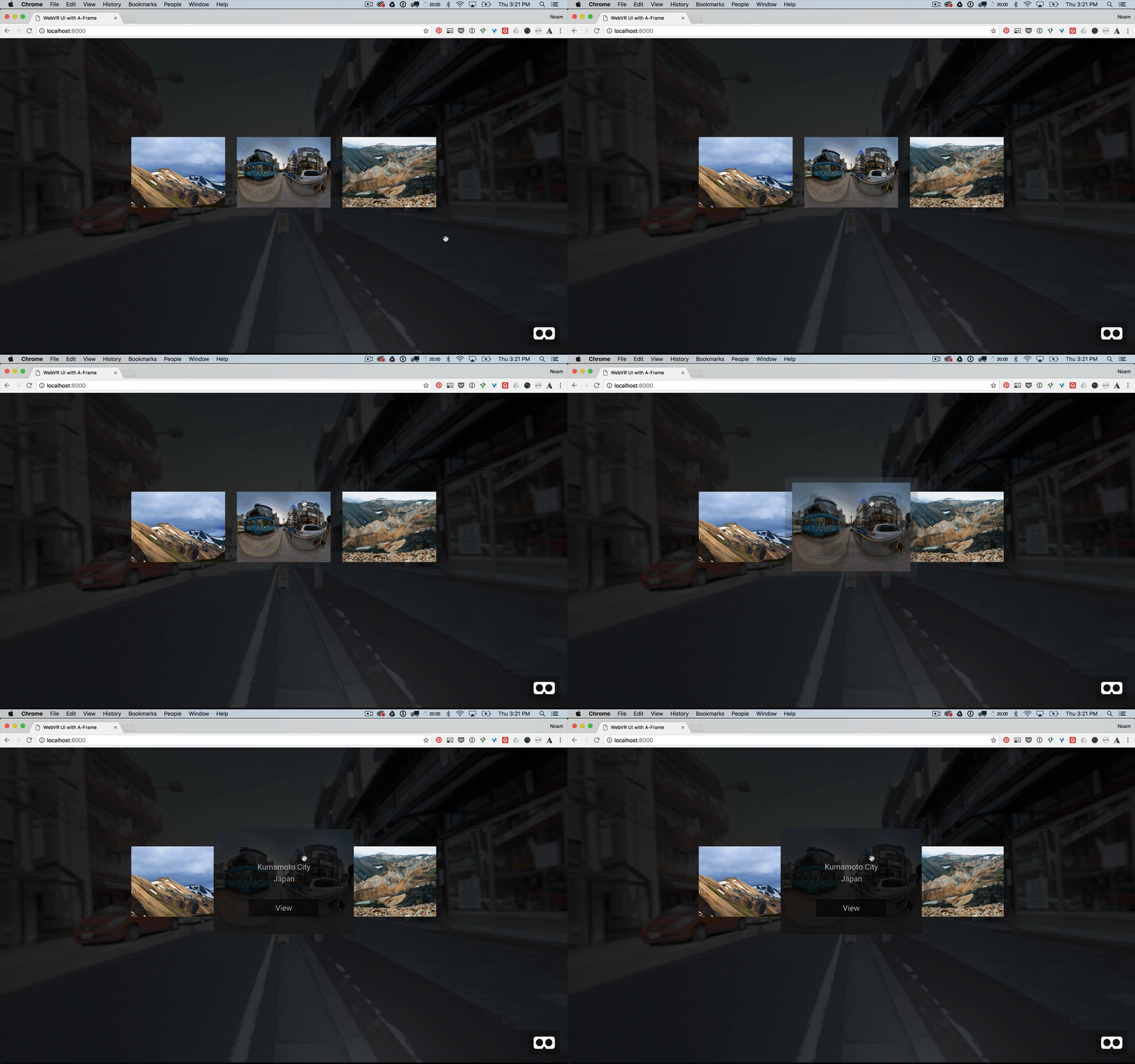
- It will scale up to 1.5.
- It will also tell its child elements (the overlay, text and View button) to fade in.
First let’s add the scale animation and “clickable“ class to the container.
<a-plane id="center-tile" class="clickable" position="0 1 -8" width="4" height="3" opacity="0"
         animation="property: scale; dir: normal; dur: 500; easing: easeOutQuad; loop: false; from: 1 1 1; to: 1.5 1.5 1.5; startEvents: click;">
...
If we do a quick test with the Show live button, we should see the tile animate up when it’s clicked:

Before we continue, let’s change the easing to feel more natural using the elastic option. Update you container’s scale animation with the elastic easing property and change the duration to 750 instead of 500. That’s 3/4 of a second vs half.
<a-plane id="center-tile" class="clickable" position="0 1 -8" width="4" height="3" opacity="0"
         animation="property: scale; dir: normal; dur: 750; easing: easeOutElastic; loop: false; from: 1 1 1; to: 1.5 1.5 1.5; startEvents: click;">
...
Now the animation should have a bit more character and some bounce!

Now we need to get our hands dirty and tell the child elements of the container to fade in when the container is clicked.
First add the following to the head of your document, right after you added the script tag for the animation component. This file is a little component I made so that when you click a container and it will send the event down to the children.
<script src="aframe.propagate.js"></script>
Now on the container add the following:
<a-plane propagate="events:clickDown" id="center-tile" class="clickable" position="0 1 -8" width="4" height="3" opacity="0" animation="property: scale; dir: normal; dur: 750; easing: easeOutElastic; loop: false; from: 1 1 1; to: 1.5 1.5 1.5; startEvents: click;">
...
You’re saying: when this container is clicked, send the event called ‘clickDown’ to the children elements, and as a result they will fade in.
Go ahead and click the Show live button and you should see the overlay fade in when you click the tile:
Create the Camera Transition
We’ve gotten quite far! Now let’s make the magic happen!
In KickPush’s example, the tile scales up to the camera, and then the scene transitions to the next surrounding.
In our prototype we’re going to have bit of fun and make the camera move forward when you click the view button. Then at the last millisecond we’ll swap the background into the new scene.
First let’s add the camera animation, then we’ll add the needed interaction to make it happen. Find your camera element at the top of the code and add the following animation to move it 8 meters forward:
<a-entity id="main-camera" camera look-controls
          animation="property: position; dir: normal; dur: 1000; easing: easeInOutQuad; loop: false; from: 0 0 0; to: 0 0 -8;
startEvents: viewDetail;">
  <a-entity cursor="rayOrigin: mouse;" raycaster="objects: .clickable"></a-entity>
</a-entity>
Now we need to connect the view button click event to the camera’s animation. We’ll use a bit of javascript to achieve this. Hopefully it’s not too intimidating, I’ll explain as I go!
Here’s what we’re going to do:
- We’ll add another script tag after the one we just added.
- Inside it, we’ll add an event listener for the View button’s click event.
- When that click occurs, we’ll emit the ‘viewDetail’ event to the camera so that it starts its animation.
- Then we’ll also set a countdown of 999 milliseconds. At the end of that countdown, we’ll swap the background image to the new one. I’ve also rotated the sphere so that the new image is at an engaging angle with leading lines.
- Finally we’ll hide the other tiles, so that the user is completely immersed in their new surroundings.
Here’s the script tag to add. You can roughly relate it to jQuery’s document ready event; where you place all your code for the page. Here we’re using A-Frame’s component system, to hook into the scene.
<script type="text/javascript">
AFRAME.registerComponent('main-ui', {
  schema: {
    events: {type: 'string', default: ''},
  },
  init: function ()
  {
    var viewButton = document.querySelector('#center-tile-cta')
    var mainCamera = document.querySelector('#main-camera')
    var mainBg = document.querySelector('#main-bg')
    var tiles = document.querySelectorAll('.tile')

    viewButton.addEventListener('click', function (e) {
      // Tell the camera to start its animation forward
      mainCamera.emit('viewDetail')

      // Wait till the last millisecond to swap the background
      // and make it brighter.
      // Finally hide the tiles.
      setTimeout(function()
      {
          mainBg.setAttribute('material', 'src', '#detail-bg')
          mainBg.setAttribute('rotation', { x: 0, y: -90, z: 0 });
          mainBg.setAttribute('material', 'color', '#fff');
          hideTiles()
      }, 999)

      function hideTiles ()
      {
        for (var i = 0; i< tiles.length; i++) {
          tiles[i].setAttribute('visible', false)
        }
      }
    })
  }
});
</script>
Now attach this component to the scene tag:
<a-scene main-ui>
...
And now for the moment of truth. Click the Show live button. When the scene is ready, click the tile, then click the view button and… KABOOM! you’re now in Kumamoto City, Japan!

Wrapping Up
This tutorial covered quiet a lot. But I hope you’re excited by your new prototype and that you want to take it further. The best thing about interaction design and development is that you get to interact with your creations!
I’ll teach you how to make this prototype work with Google Cardboard in a future post!
You can check out the final code here. And let me know what you think on twitter!
Image credits: